KADAMBA PRIME BUSINESS
Mobile Responsive Website
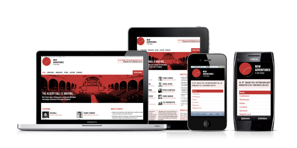
Creating a mobile-responsive website for Kadamba Prime Business involves designing and developing a website that provides an optimal viewing and interaction experience across a wide range of devices, including smartphones and tablets. Here’s a brief overview of the process:

- Understanding Mobile Responsiveness: Recognize the importance of mobile responsiveness, which ensures that the website’s layout, content, and features adjust dynamically based on the user’s device screen size and orientation.
- Identify Target Audience: Understand the target audience of Kadamba Prime Business and their device usage habits. Determine the most common devices and screen sizes used by the target audience to tailor the mobile-responsive design accordingly.
- Choose a Responsive Framework: Select a responsive design framework or approach that best suits the needs and preferences of Kadamba Prime Business. Popular options include Bootstrap, Foundation, and CSS Grid. These frameworks offer pre-built components and layouts optimized for mobile devices.
- Design for Mobile First: Adopt a “mobile-first” approach to design, focusing on creating a seamless and intuitive user experience for mobile users. Begin by designing the website layout, navigation, and content structure for smaller screens before scaling up to larger devices.
- Flexible Layouts and Grids: Use flexible layouts and grids to ensure that the website adapts fluidly to different screen sizes. Use percentage-based widths, flexible images, and media queries to adjust the layout and content placement for optimal viewing on various devices.
- Touch-Friendly Elements: Optimize the website’s navigation and interactive elements for touch input. Use larger touch targets, spacing between elements, and intuitive gestures to enhance usability and accessibility for mobile users.
- Optimize Images and Media: Optimize images and media files for fast loading times on mobile devices. Use responsive images, lazy loading, and compression techniques to minimize file sizes without sacrificing quality.
- Content Prioritization: Prioritize and streamline content for mobile users, focusing on delivering the most relevant and essential information upfront. Condense text, use concise headlines, and prioritize key actions to guide users through the mobile experience efficiently.
- Performance Optimization: Optimize the website’s performance for mobile devices by minimizing HTTP requests, leveraging browser caching, and reducing unnecessary scripts and resources. Test the website’s loading speed on various mobile networks to ensure optimal performance.
- Cross-Browser and Device Testing: Test the mobile-responsive website across different browsers, devices, and operating systems to ensure consistent rendering and functionality. Use browser developer tools and online testing platforms to identify and fix any compatibility issues.
- Continuous Improvement: Monitor user feedback, analytics data, and mobile usability testing results to identify areas for improvement. Continuously iterate on the mobile-responsive design, addressing user needs and evolving technology trends to enhance the mobile experience for Kadamba Prime Business’s audience.